Good Grief Death Positivity Coalition
The Logo
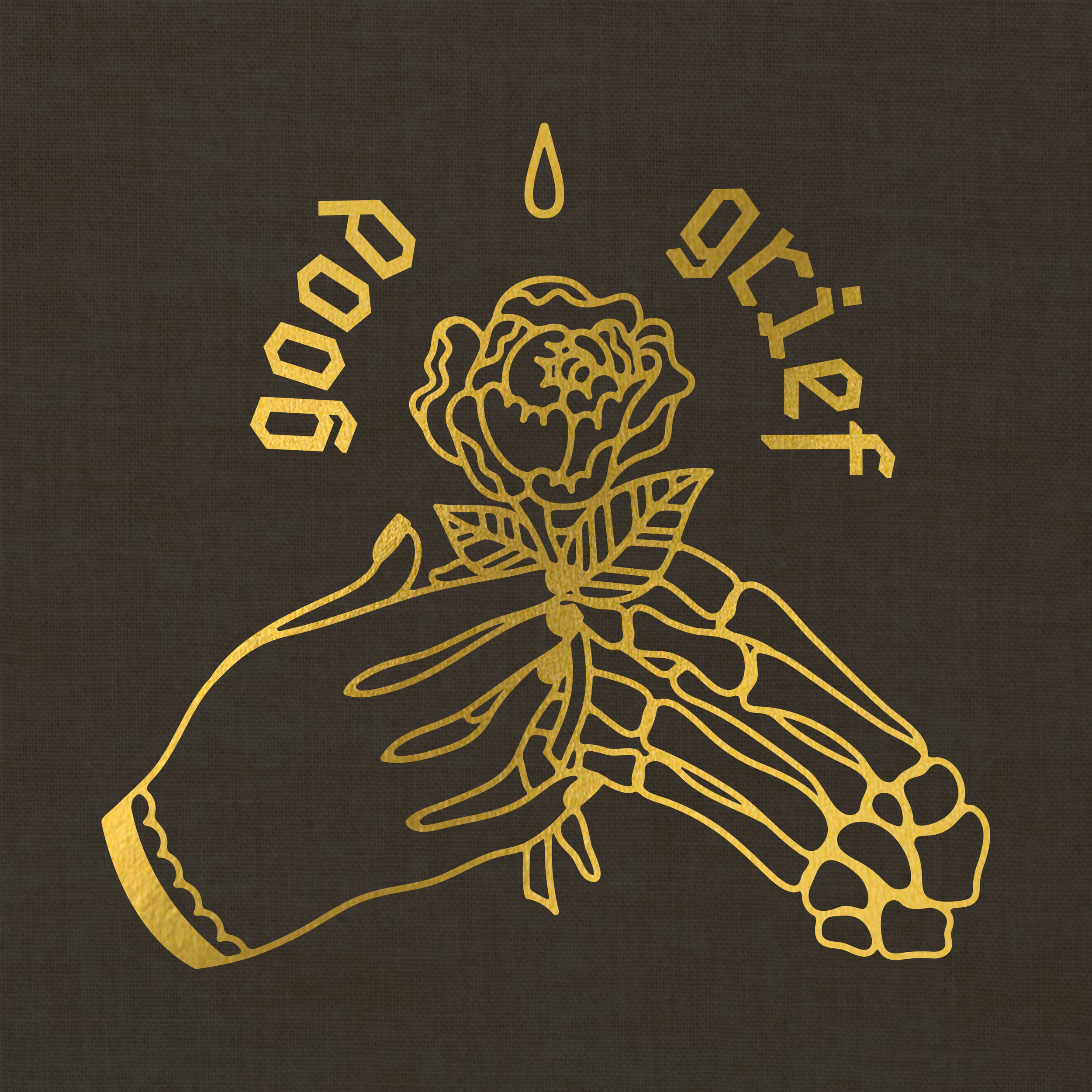
Good Grief is a death positivity coalition that aims to get rid of the taboo nature of death and make it a more accepted and natural part of life (it also doesn’t exist, I made it up). They also aim to educate and inform the public about the funerary industry and more ethical, environmentally friendly funerary practices. Positive and healthy mourning is also at the forefront of their goals. This logo represents these ethos through the living hand gracefully transitioning the rose to the dead hand, the teardrop above the rose, and the tombstone shape of the logotype.
I chose for the business cards to be a die-cut casket shape because while the organization is death-centric, they are still stylish and playful in an appropriate way. The candle icon was added to illustrate that light can be found in the darkness of pain.
The Business Cards
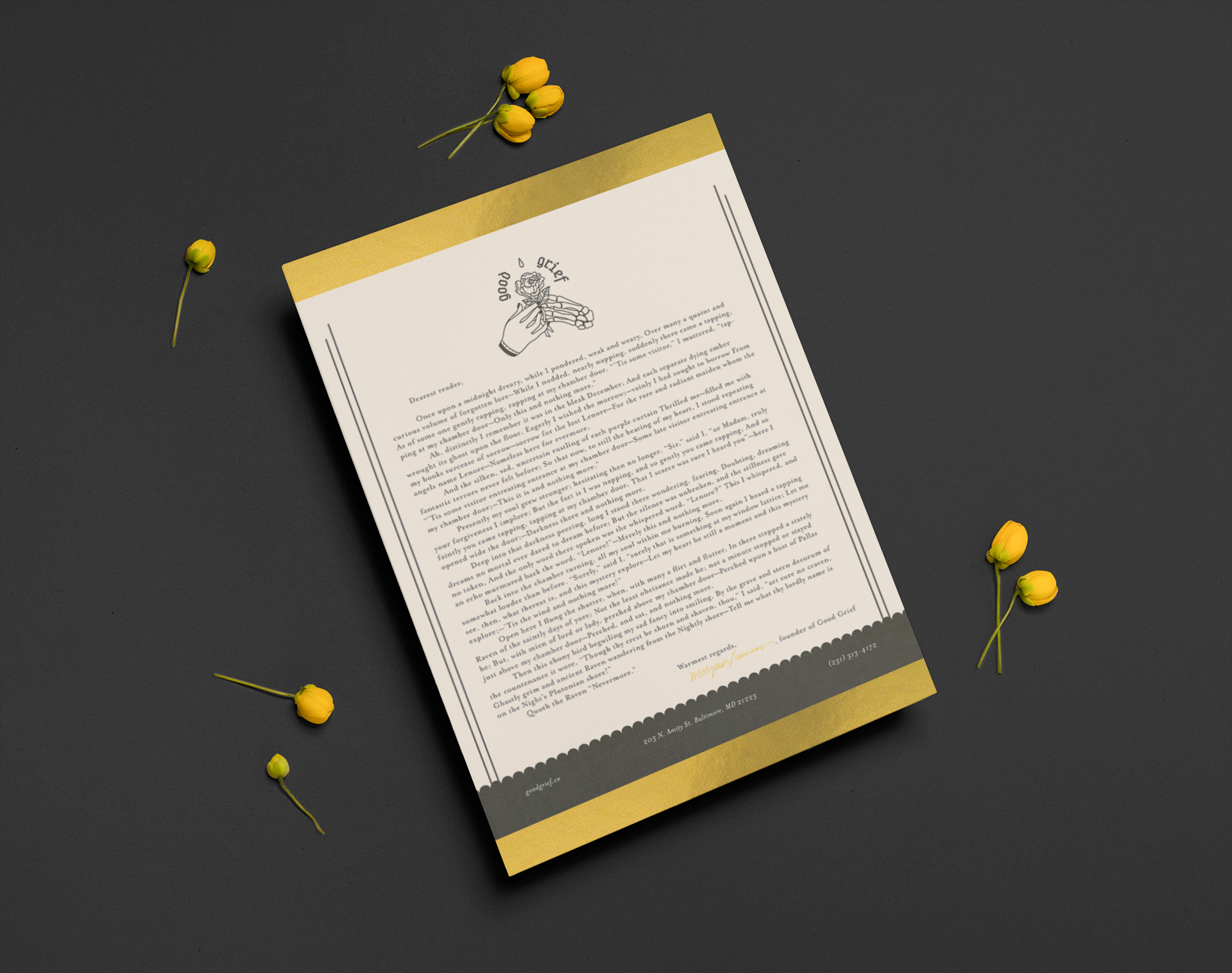
The front and back of the stationery can be seen below. I wanted it to be simple, modern, and elegant like the rest of the brand. Little elements and icons from the rest of the branding, such as the candle icon and border lines, come together to make a cohesive overall package for the organization.
The Stationery
This custom black stock envelope with gold foil accents acts as an echo of the stationery paper and ties the whole branding package together.
The Envelope


